
Educational
UI vs UX Design: What's the Difference and Why It Matters
July 25, 2026
"We need better UI/UX" might be the most common sentence in software briefs — and one of the least precise. The two disciplines get welded together into one acronym so often that many founders sign off on projects without knowing which one they are actually buying. The distinction is worth two minutes of your time, because it changes what you should ask for, what you should pay for, and how you should judge the result. Here is the UI UX design difference in plain English.
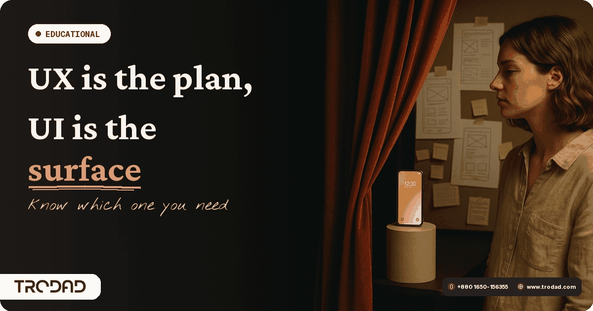
UX is the plan, UI is the surface
The cleanest way to hold the difference in your head:
- UX (user experience) design is the plan. It answers: who is using this, what are they trying to accomplish, what steps do they take, and where do they get stuck? UX work produces research findings, user flows, wireframes, and prototypes. It is mostly invisible in the final product — the way good architecture is invisible in a house that simply feels right.
- UI (user interface) design is the surface. It answers: what does each screen look like, and how does it communicate? UI work produces the visual layer — typography, colour, spacing, components, states, motion. It is everything you can point at.
A restaurant analogy holds up well: UX is the menu structure, the order of courses, how the waiter guides the evening. UI is the plating. Beautiful plating cannot save a confusing menu and a two-hour wait between courses — and a brilliantly planned dinner served on paper plates undersells itself. You need both, and they are different jobs.
How they work together in a real project
In practice, the disciplines interleave rather than queue. Here is the flow we run for product work at TRODAD:
- Research first. Understand the users, the business goal, and the competitive landscape. Every strong opinion about screens should trace back to something learned here.
- Flows and wireframes. Map how users move through the product and sketch structure without visual polish — cheap to change now, expensive to change later.
- Prototype and test. A clickable prototype puts the plan in front of real people before a line of production code exists. This is where wrong assumptions die inexpensively.
- UI design. With the plan validated, the visual system is designed: components, hierarchy, brand expression, accessibility, every state a screen can be in.
- Deliver and iterate. Design ships in files developers can build from directly, and revisions run until it is right — our design deliveries run on a 48–100 hour cycle, with revisions welcome until you are fully satisfied.
Notice what this ordering prevents: the classic failure of decorating screens before anyone has verified the plan behind them. That failure mode is precisely what people mean when they say a product is "pretty but unusable." Both our UI/UX design service and our web app design service are structured around this research-first sequence.
What bad UX actually costs
Bad UI is embarrassing, but bad UX is expensive — and it hides in your metrics rather than announcing itself:
- Abandoned journeys. Every confusing step in a signup or checkout sheds real users. Small per-step losses compound into large revenue gaps.
- Support load. When users cannot figure something out, they either leave or email you. A recurring support question is usually a UX defect wearing a costume.
- Wasted engineering. The most expensive software mistake is building the wrong thing well. Weeks of development on a flow users did not want costs more than the research that would have caught it.
- Silent churn. Users rarely report friction; they just stop coming back. By the time churn is visible in the numbers, the cause is months old.
The uncomfortable rule of thumb: every hour of skipped UX work returns as many hours of rework, support, and lost conversion — with interest.
So which one does your project need?
If your product looks dated but users complete their tasks easily — you likely need UI work: a visual refresh on a sound structure. If the product looks fine but users hesitate, abandon flows, or flood support with "how do I…" questions — that is UX work, and repainting the surface will not fix it. If you are starting from zero, you need both, in the order described above. When in doubt, a short UX audit answers the question with evidence instead of opinion.
Five UX self-tests you can run this week
You do not need a research lab to get a first read on your own product's UX. These five tests cost nothing but an hour:
- The five-second test. Show your homepage to someone unfamiliar with your business for five seconds, then ask what the company does. If they cannot answer, your visitors cannot either.
- The stranger task. Ask a friend to complete your core action — book, buy, sign up — while you watch silently. Every hesitation and wrong click you observe is a finding. Resist the urge to help; your real users get no narrator.
- The support-ticket audit. Read your last thirty support messages and tally the questions. Any question asked three or more times marks a place where the interface failed to explain itself.
- The phone test. Complete your own checkout or signup on a mid-range phone over mobile data, outdoors. Desktop-on-fibre is how teams experience their product; phone-on-4G is how customers do.
- The funnel walk. Open your analytics and follow the numbers step by step through your key flow. The step with the steepest drop-off is your highest-priority UX investigation — the data tells you where, watching users tells you why.
If these tests surface problems, that is good news: found problems are fixable problems, and you now know whether you are shopping for UI polish or UX repair.
FAQ
Is UX only for apps, or does it apply to websites?
Every website has a user experience — the only question is whether it was designed or accumulated. A five-page marketing site still has journeys: find the service, trust the company, contact them. UX discipline applies at every scale.
Can one designer do both UI and UX?
Many designers work across both, and on small projects that is normal. What matters is that both jobs get done deliberately — research and flows are not skipped just because one person owns the whole surface.
What deliverables should I expect from a UX phase?
Typically: research findings, user flows, wireframes, and a clickable prototype — plus the reasoning behind decisions. If a proposal jumps straight to polished screens, the plan phase is being skipped.
How do I measure whether design work paid off?
Pick metrics before the project: task completion, conversion rate, support ticket volume, time-to-value for new users. Good design work moves numbers you can name in advance.
Design the plan, then the surface
One closing habit worth stealing from good design teams: whenever someone proposes a change to a screen, ask which problem it solves — a plan problem or a surface problem. That single question keeps meetings honest, budgets targeted, and products improving in the order that matters.
The UI vs UX distinction is not trivia — it is a purchasing guide. Know which problem you have, insist on the plan before the paint, and your design budget starts compounding instead of decorating. Book a free consultation — let's talk about your project. trodad.com/appointment
Share:
Newsletter
Enter your email address below to subscribe to my newsletter
Related Posts


LOCATION
USA
Lenox Hill, Manhattan,
New York
BANGLADESH
House - 761, Road - 10, Avenue - 6, Mirpur DOHS, Dhaka - 1216, Bangladesh
LOCATION
USA
Lenox Hill, Manhattan,
New York
BANGLADESH
House - 761, Road - 10, Avenue - 6, Mirpur DOHS, Dhaka - 1216, Bangladesh
©2018-2026 All Rights Reserved. TRODAD is a registered trademark of TRODAD International LTD. Apple and the Apple logo are trademarks of Apple Inc. Google Play and the Google Play logo are trademarks of Google Inc. Privacy | Terms | Security | Cookie Preferences