
10 Stunning White Website Examples in 2025
Want to create a sleek, professional website that feels timeless and modern? Start with white.
White websites have a clean, minimal aesthetic that puts content in the spotlight and creates space for creative storytelling, bold typography, and stunning visuals.
In this article, we’ll show you 10 real-world examples of beautifully designed white websites—from digital agencies to eCommerce stores—and share 5 expert tips to help you master the art of white-space-driven design.
Why White Websites Work So Well
White isn’t just a background—it’s a design powerhouse. Used thoughtfully, white space enhances readability, draws attention to important elements, and creates a sense of calm and clarity. Here's why so many designers favor white in modern website design:
Focus: It strips away distractions and lets the content breathe.
Versatility: It works across industries—corporate, creative, and personal.
Elegance: Minimalism feels fresh, trustworthy, and premium.
User-Friendly: Clean layouts improve navigation and user experience.
Now, let’s explore some of the best white website designs that show just how powerful simplicity can be.
1. Net Dreams Studio – Immersive Grid with Interactive Flair
London-based Net Dreams Studio proves that white doesn’t mean plain. Their portfolio site uses a grid-based layout, interactive logo animation, scrolling effects, and ultra-thin line graphics in the background that add sophistication without clutter.
Why we love it: Perfect harmony between animation and negative space.
2. Xizt DevOps – High-Tech Minimalism with Motion
At first glance, Xizt’s website looks simple and corporate. But once you scroll, it unfolds into a dynamic storytelling experience. Expect to see motion typography, 3D animated elements, parallax layers, hover effects, and real-time data visualizations—all on a clean white canvas.
Why we love it: A masterclass in blending functionality with sleek, white design.
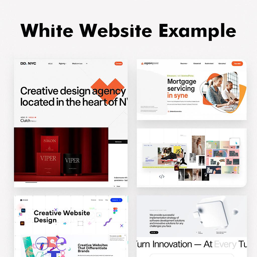
3. DD NYC Technologies – White, Bold, and Interactive
This WordPress-powered site by Digital Design NYC fuses branding and user experience with flair. It features After Effects animations, cursor-sensitive backgrounds, and an intentionally "broken" layout that still feels cohesive and engaging.
Why we love it: It’s chaotic in all the right ways—balanced perfectly by a white foundation.
4. Outpost Design Studio – Clean Meets Bold
Outpost’s website leverages a white background with a broken grid, large typography, and parallax scrolling to spotlight their creative work. Minimal, but visually magnetic.
Why we love it: The white space sharpens focus on each interactive element.
5. Bunka Digital Agency – Scroll with Style
This agency site may look like it belongs to a food brand, but it's actually a powerhouse in branding and graphic communications. Built on WordPress, it features infinite scroll, parallax effects, and motion typography, all elegantly tied together with a crisp white aesthetic.
Why we love it: Great use of modern effects without losing the clean feel.
6. AtomsWorld Energy – Animated with Purpose
AtomsWorld communicates a bold mission through design. The site features advanced Three.js animations, parallax scrolling, and engaging hover effects—all against a bright white background that keeps the message sharp.
Why we love it: The clean palette reinforces trust and clarity in a complex subject.
7. Aspen Grove Mortgage Services – Sleek and Straightforward
A perfect example of white design in the corporate world. Aspen Grove separates content using white and light gray sections, with subtle micro-interactions to keep things engaging without being flashy.
Why we love it: Professional, readable, and distraction-free.
8. Heights Digital Agency – Next-Level Minimalism
Cayman-based Heights offers a portfolio site packed with smooth scroll animations, hover effects, lazy loading, and even an animated preloader—all wrapped in a sophisticated white layout that screams creativity.
Why we love it: Minimalist on the surface, dynamic underneath.
9. CSD (CAD Distributor) – Functional White Design
This corporate website uses a multi-column grid layout and integrates interactive 360° 3D models, creating a unique user experience without sacrificing clarity or professionalism.
Why we love it: Smart use of white space to keep high-tech features accessible.
10. WonderWall Studio – Magazine Aesthetic Meets Parallax
WonderWall, a wallpaper design company, makes white look luxurious. With a horizontal navigation, full-screen menu, gallery-style layouts, and elegant hover effects, this site feels like flipping through an art book.
Why we love it: Editorial elegance paired with digital interactivity.
5 Expert Tips for Designing with White Backgrounds
Want your white website to look stunning instead of sterile? White space is a powerful design element—but only when used thoughtfully. Here are five expert strategies to make your white-background website visually compelling and user-friendly:
1. Soften the White for a More Comfortable Experience
While pure white (#FFFFFF) looks clean, it can feel harsh or clinical when used across large areas—especially on high-resolution screens or in low-light environments. To create a more inviting visual experience:
-
Use off-whites like #FAFAFA or #F5F5F5 to reduce glare.
-
Consider warm white tones with a hint of cream or gray to add personality and reduce visual fatigue.
-
Use subtle gradients or textured backgrounds to add depth without compromising minimalism.
Pro Tip: Test your color on multiple devices to ensure it looks soft and natural in different lighting conditions.
2. Create Contrast to Guide the Eye
White backgrounds give you a blank canvas—but without contrast, everything blends in. Use contrast to direct user attention and create a clear visual hierarchy:
-
Combine bold or dark-colored typography against the light background for maximum readability.
-
Introduce vibrant images or colored shapes to break the monotony.
-
Add drop shadows, borders, or outlines to help important elements stand out (like cards, buttons, or content blocks).
Goal: Make sure users can instantly spot key content, CTAs, or navigation points.
3. Let Typography Take Center Stage
With fewer design distractions, your typography becomes a visual anchor. Make it count:
-
Choose 1–2 distinct fonts—such as a bold sans-serif for headlines and a readable serif or sans-serif for body text.
-
Use scale and weight (like extra-bold headlines paired with regular or light body text) to create rhythm.
-
Adjust line height, letter spacing, and alignment to ensure everything reads effortlessly across screen sizes.
Expert Insight: In minimal white designs, typography isn’t just for communication—it’s a design element in itself.
4. Use Space Intentionally, Not Just Emptily
White space isn’t wasted space—it’s active, functional, and essential. Thoughtful use of spacing can elevate a simple layout into a premium experience:
-
Use ample padding and margins to separate sections and avoid crowding.
-
Embrace a grid system to maintain alignment and structure across content.
-
Let elements “breathe”—give important content extra spacing to draw focus.
Design Rule: White space enhances focus, makes content more digestible, and boosts overall aesthetics.
5. Add Just One Accent Color for Pop
A white background gives you the perfect canvas to make one accent color truly shine. This technique keeps your design minimal yet expressive:
-
Pick a single vivid, high-contrast color (like coral, teal, electric blue, or burnt orange).
-
Use it sparingly for CTAs, links, icons, hover states, or visual highlights.
-
Be consistent—too many colors will dilute the minimalist effect.
Color Psychology Tip: Choose a color that reflects your brand’s personality and elicits the emotion you want users to feel.
Designing with white backgrounds is all about balance, contrast, and intentionality. These five tips help ensure your white website feels elegant, engaging, and anything but boring.
Wrapping Up: Simplicity That Speaks Volumes
White doesn’t mean boring—it means refined, modern, and user-centric.
These 10 website examples prove how a white color scheme can amplify creativity, enhance usability, and deliver a visual experience that feels both calming and cutting-edge.
So, whether you're building a personal portfolio, agency site, or corporate platform, white space might just be your best design decision.
Want more UI/UX inspiration?
Check out our other design deep-dives:
7 Best Animation Website Examples We Love
The Complete Guide to SEO-Friendly Web Design in 2025
Tips for Choosing the Right Color Palette: Creating an Engaging Website.
Share:
LOCATION
USA
Lenox Hill, Manhattan,
New York
BANGLADESH
House - 761, Road - 10, Avenue - 6, Mirpur DOHS, Dhaka - 1216, Bangladesh
LOCATION
USA
Lenox Hill, Manhattan,
New York
BANGLADESH
House - 761, Road - 10, Avenue - 6, Mirpur DOHS, Dhaka - 1216, Bangladesh
©2018-2026 All Rights Reserved. TRODAD is a registered trademark of TRODAD International LTD. Apple and the Apple logo are trademarks of Apple Inc. Google Play and the Google Play logo are trademarks of Google Inc. Privacy | Terms | Security | Cookie Preferences